Amazon Kindle Rentals
Case study for adding a feature to an existing product.
*Best viewed on desktop
Project Overview
BACKGROUND
Amazon launched their Kindle e-reader in 2007 alongside the Kindle store for the purchase of eBooks. When it launched, the store had 88,000 digital titles available in the U.S. It is estimated that there are over 12 millions Kindle eBooks available for purchase today.
THE SOLUTION
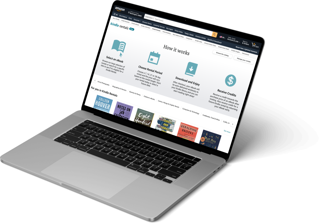
Kindle Rentals is a feature I created for Amazon’s Kindle store that would allow users to rent eBooks. My goal was to seamlessly integrate this feature into Amazon’s existing design system.
THE PROBLEM
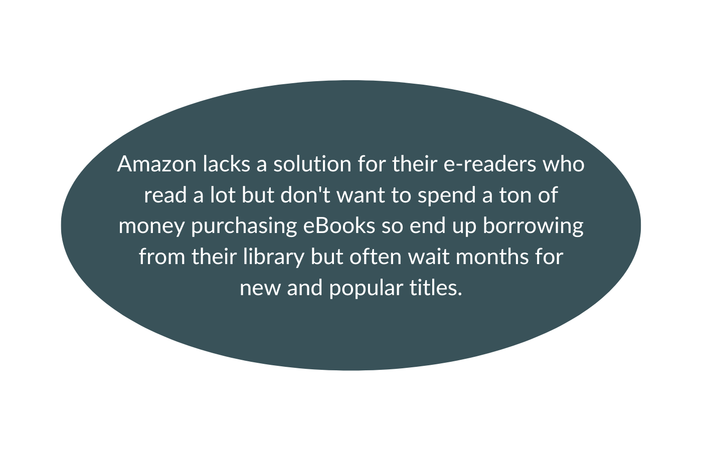
With the rise in e-reading, most public libraries now offer digital books for loan. However, for new and popular titles, the hold times can be months and then the loan period is typically only 14 days. A lot of readers will choose to wait for a book from the library rather than purchasing it.
MY ROLES
User Research
UX/UI Design
Prototyping
Usability Testing
TOOLKIT
TIMELINE
2 weeks, approximately 80 hours
Design Process
Discover
Research Goal
We want to learn if users would find it valuable if Amazon offered an ebook rental service through their Kindle Store.
Learn how often users buy books vs. borrow from the library.
Learn what platforms users use for borrowing books.
Understand user’s motivation for buying a book.
Identify if users would rent ebooks.
Research Objectives
Research Methodologies
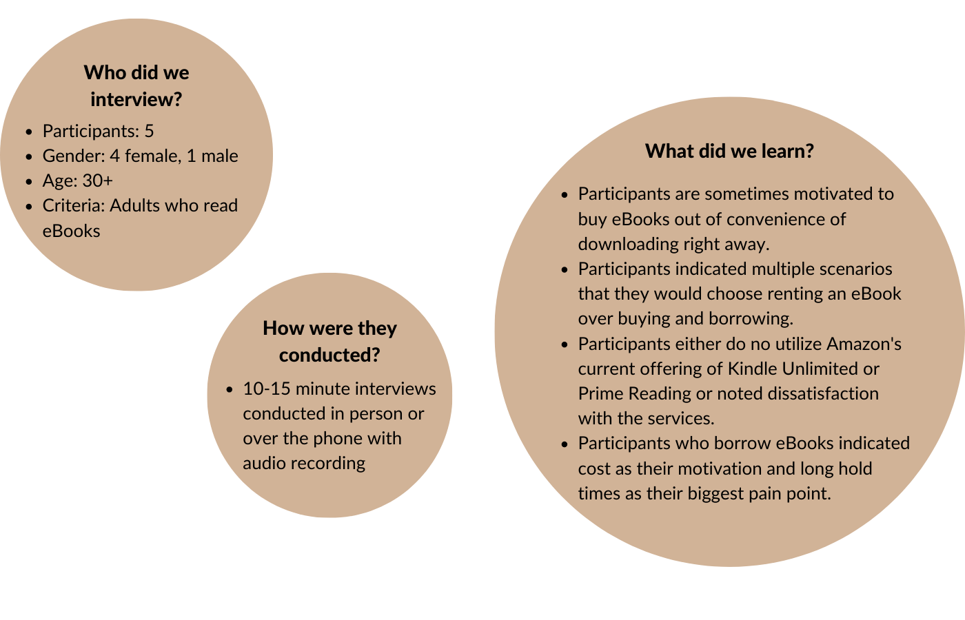
To conduct my research, I decided to utilize competitive analysis to see what the market is offering, sizing a business opportunity to understand the impact this feature would have on Amazon’s business, and user interviews to understand users’ needs.
Competitive Analysis
In my research, I discovered that there is no service available for renting individual eBooks. So, I performed a competitive analysis on an alternative eBookstore, an eBook subscriptions service, and OverDrive, the platform used by public libraries for lending eBooks. While Amazons leads the market in eBook purchases and Kindle are the most commonly used e-reader, I came away with some key findings.
Summary of Findings:
Multiple ebook subscription based services have become available with the most popular being Scribd
Many ebook readers, including Kindle, are not compatible with ebook subscription services
Ebook subscription services offer limited libraries of ebooks
For Kindle users, OverDrive is not integrated into Kindle store so users have to use separate platform to borrow books then send to Kindle
Best sellers are often not available through subscription based services and can take months to obtain from OverDrive
User Interviews
Sizing a Business Opportunity
In order to understand the impact a Kindle Rentals could have on Amazon’s business, I had to first better understand Amazon’s current Kindle store offerings.
Summary of Findings:
Amazon Kindle holds 72% of the e-reader market
Amazon is the preferred marketplace for purchasing e-books (60-70%)
After an uptick in ebook sales in 2021 due to the COVID-19 pandemic, there has been a decline over the last year
Kindle Unlimited is a subscription service that gives unlimited access to borrow from a selection of over 3 million titles for a $9.99 monthly fee; however, the selection is limited and does not include books from the “Big 5” publishers
Prime Reading is included with every Prime membership and gives unlimited access to an even smaller selection of titles (3,000) free
Amazon offered a Lending Library that allowed Prime members to borrow 1 ebook per month from the Kindle store for free but discontinued this service in 2021
Define
Overview
During the define phase, I took what I learned from discovery to plot out pain points and define the problem that both my user and business need solved.
Affinity Mapping
Affinity mapping helped me synthesize the qualitative data I received from my user interviews so that I could better define my target user.
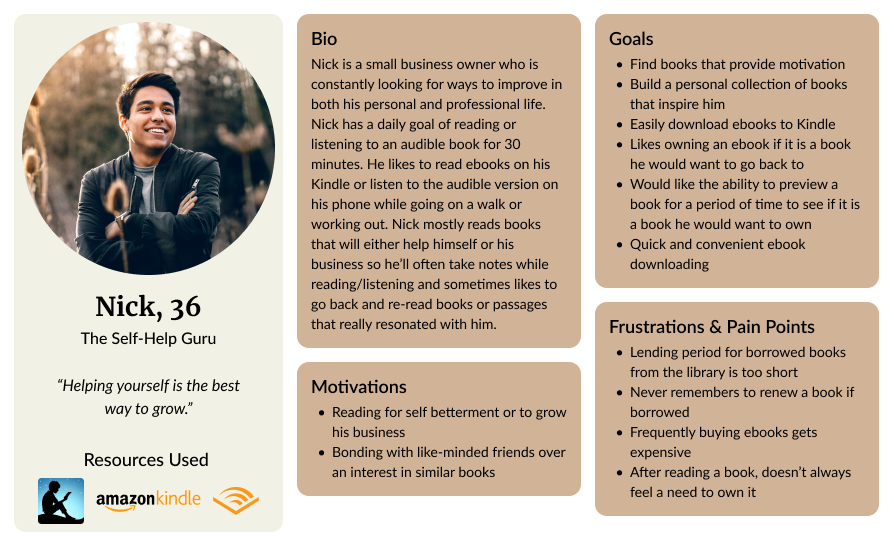
User Personas
With the data gathered from my research, I generated 2 personas to help understand my user’s goals, motivations, needs and frustrations. Maria became my primary persona throughout this project in informing design decisions.
The Problem
Ideate
Overview
With my user and problem defined, I moved into the ideate phase of the process to better outline product development. To start, I mapped out the project goals to ensure the business goals, users goals and technical considerations were in alignment throughout this phase.
Sitemap
Next, I created a sitemap to outline how the Kindle Rentals feature would fit into Amazon’s current site. Due to Amazon’s complex sitemap, I focused on the areas that would pertain to the Kindle Rentals feature including the Kindle store and the digital content page.
*The Kindle Rentals pages are shown in orange.
User/Task Flows
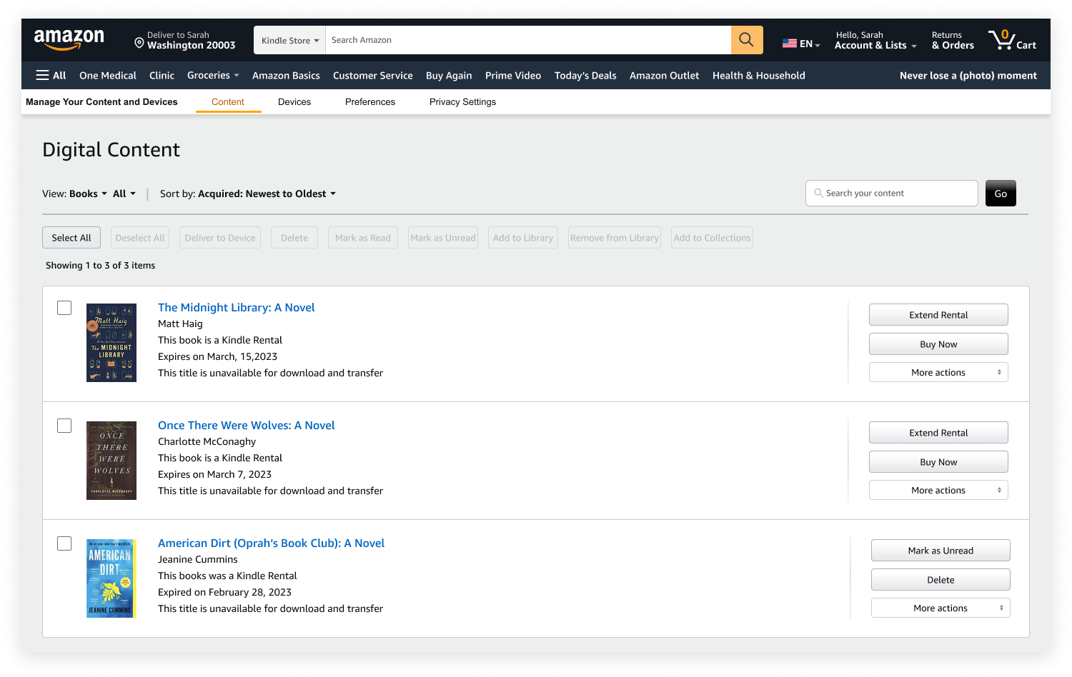
With my primary persona in mind, I created a user flow for renting an eBook and task flows for managing a Kindle Rental including:
Extending a rental
Buying a rental
Returning a rental early
Design
Overview
With my project goals established, a sitemap constructed, and user flow created, I entered the design phase.
Low-Fi Wireframes
I began by sketching key screens on paper. I decided my key screens included the Kindle Rentals homepage, a details page and a rentals management page. You are not able to purchase a Kindle book in either the Amazon app nor the Kindle app so I decided to design for desktop.
Mid-Fi/High-Fi Wireframes
I converted my low-fidelity sketches into digital format using only black, white and gray, then gathered Amazon’s style and design guidelines into a UI kit to apply to my high-fidelity wireframes.
Test
Overview
With my high-fidelity prototype, I performed usability testing and used that feedback to iterate on my designs.
Usability Testing
Analyzing & Prioritizing Results
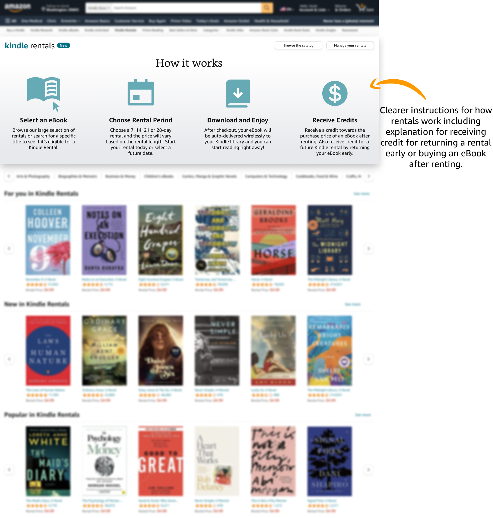
Prioritizing the feedback I received with a feedback grid, I was able to hone in on what aspects of my design to iterate on and perform priority revisions. Overall, users would have liked more information surrounding credits from returning a rental early and buying an eBook after renting earlier on in their journey. Also, most users would not go directly to the Kindle Store and would instead search for a specific title on Amazon’s homepage.
Priority Revisions
Conclusion & Reflection
Seamlessly integrating a feature into an existing design system is a challenging task. During usability testing, the feedback I received was that my feature felt like it fit into Amazon’s current site and that this would be a feature users would like to see.
A few things I learned from this project:
Consistency in design helps create a brand’s identity.
Just because you think something is a good idea does not mean it is desirable to most users. It is important to validate a hypothesis through research.
It is important to keep business goals in mind throughout your design process to ensure both user’s needs and the business’s needs are being met.

