Healthify
Case study for a healthcare platform that connects users to in-home preventative care services
*Best viewed on desktop
Project Overview
BACKGROUND
Preventative care helps reduce the risk of disease, illness and other health problems as well as detects disease early before it becomes a bigger problem. According to health.gov, millions of Americans don’t get recommended preventative health care services. People often push off going to the doctor until there is a problem when often, these problems could have been prevented or detected early and treated through preventative care services.
THE PROBLEM
For a lot of people, preventative healthcare is not a priority so keeping up with age/gender recommended services often falls to the wayside. Annual flu shots, regular blood pressure checks, routine cholesterol levels are just a few preventative care services that can help prevent and detect disease but that many people don’t keep up with.
THE SOLUTION
Healthify is a platform that allows users to schedule routine preventative care services in the comfort of their own home. Through my research, I discovered that lack of time and knowledge were the biggest barriers to users not keeping up with their preventative care. Healthify solves both of these pain points by recommending services based on a user’s demographic information and allows them to schedule an appointment in their own home.
MY ROLES
User Research
UX/UI Design
Branding
Prototyping
Usability Testing
TOOLKIT
TIMELINE
5 weeks, approximately 120 hours
Design Process
Discover
Research Goal
We want to learn what barriers people face when it comes to keeping up with their preventative healthcare so that we can build a tool that helps and encourages the user to prioritize preventative care.
Learn how people currently manage their health and healthcare services.
Learn how motivated people are in prioritizing preventative care.
Understand what tools people utilize to optimize their health.
Discover pain points and barriers to prioritizing and accessing preventative care.
Research Objectives
Research Methodologies
To conduct my research, I decided to do a combination of user interview and competitive analysis to better understand the user’s needs and what the market is currently offering.
Competitive Analysis
An initial competitive analysis was performed on Fountain Life, My Fitness Pal, Forward and Noom to compare their strengths, weaknesses and features. Each platform focuses on a specific area of preventative health (i.e. weight loss).
This part of my research helped to define where my product could fit in the market. There was no one platform that offered a one stop shop for preventative care. There was also no platform that solved the problem of efficiency and convenience.
As the product evolved, competitive analysis continued with platforms including CVS Health and Quest Diagnostics.
User Interviews
Define
Overview
During the define phase, I took what I learned from discovery to plot out pain points and define the problem my user needs solved.
Affinity Mapping
To start, I synthesized the qualitative data gathered from user interviews in the form of an affinity map.
User Personas
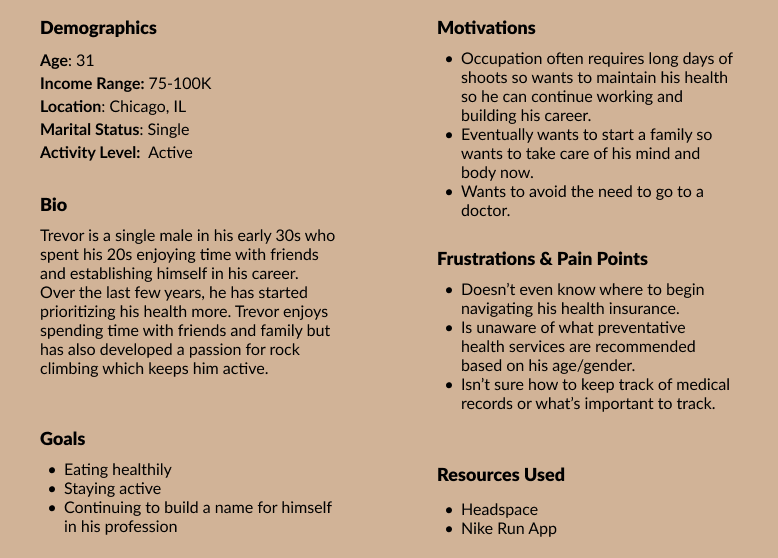
With the data gathered from my research, I generated 2 personas to help understand my user’s goals, motivations, needs and frustrations.
The working mom
Emily
“I want to stay healthy for my kids but can’t always find the time to prioritize my own health.”
The young professional
Trevor
“I try to take care of my health so I don’t have to go to the doctor.”
The Problem
Ideate
Overview
With my user and problem defined, I moved into the ideate phase of the process to come up with a solution to my user’s problem. Ideation to prioritization started with generating a lot of possible solutions to my problem though playing with opposites and creative constraints and then finished with a narrowed down idea for my product.
Low-Fi Prototyping
With my 2 high level concepts, I began visualizing the narrative my end-user would go through if they were to experience these ideas through building low-fidelity prototypes in the form of storyboards.
Project Goals
Product Roadmapping
With my final idea selected, it was time to clarify what features would be needed for my minimal viable product through creating a product roadmap and prioritizing features.
Information Architecture
With a clear picture of what would be included in my product, it was time to develop the conceptual structure. A card sorting activity was completed to help validate the content needed on key screens. Using the results from my card sort, I created a sitemap for my product.
User/Task Flows
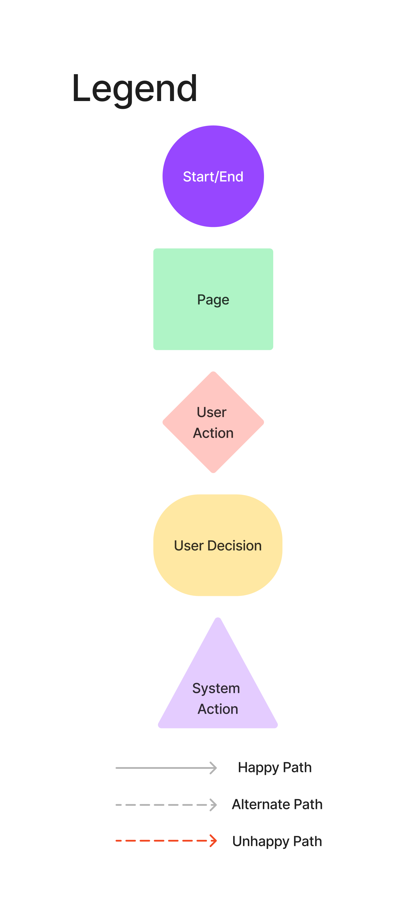
With my user personas in mind, I created user flows for the 2 tasks they would need to accomplish:
Sign Up/Log In
Book a Service
Design
Overview
With a feature set decided on, a sitemap established, and user/task flows created, I entered the design phase.
Low-Fi Wireframes
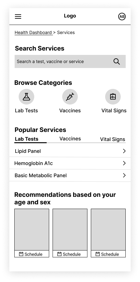
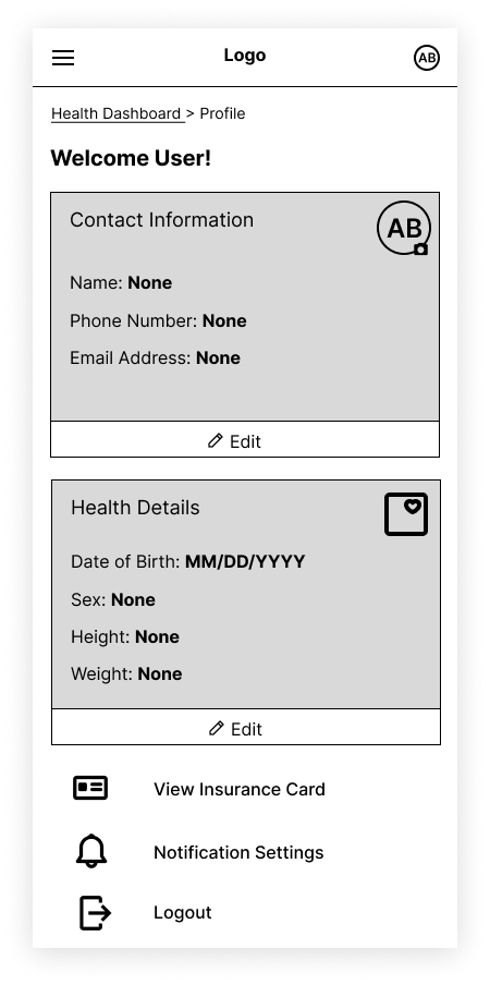
I began by sketching key screens on paper. I decided my key screens included the homepage, the find a service page, and the profile page.
Mid-Fi Wireframes
I then converted my low-fidelity sketches into digital format using only black, white and gray to prepare for prototyping and testing. I also optimized my 3 key screens for desktop.
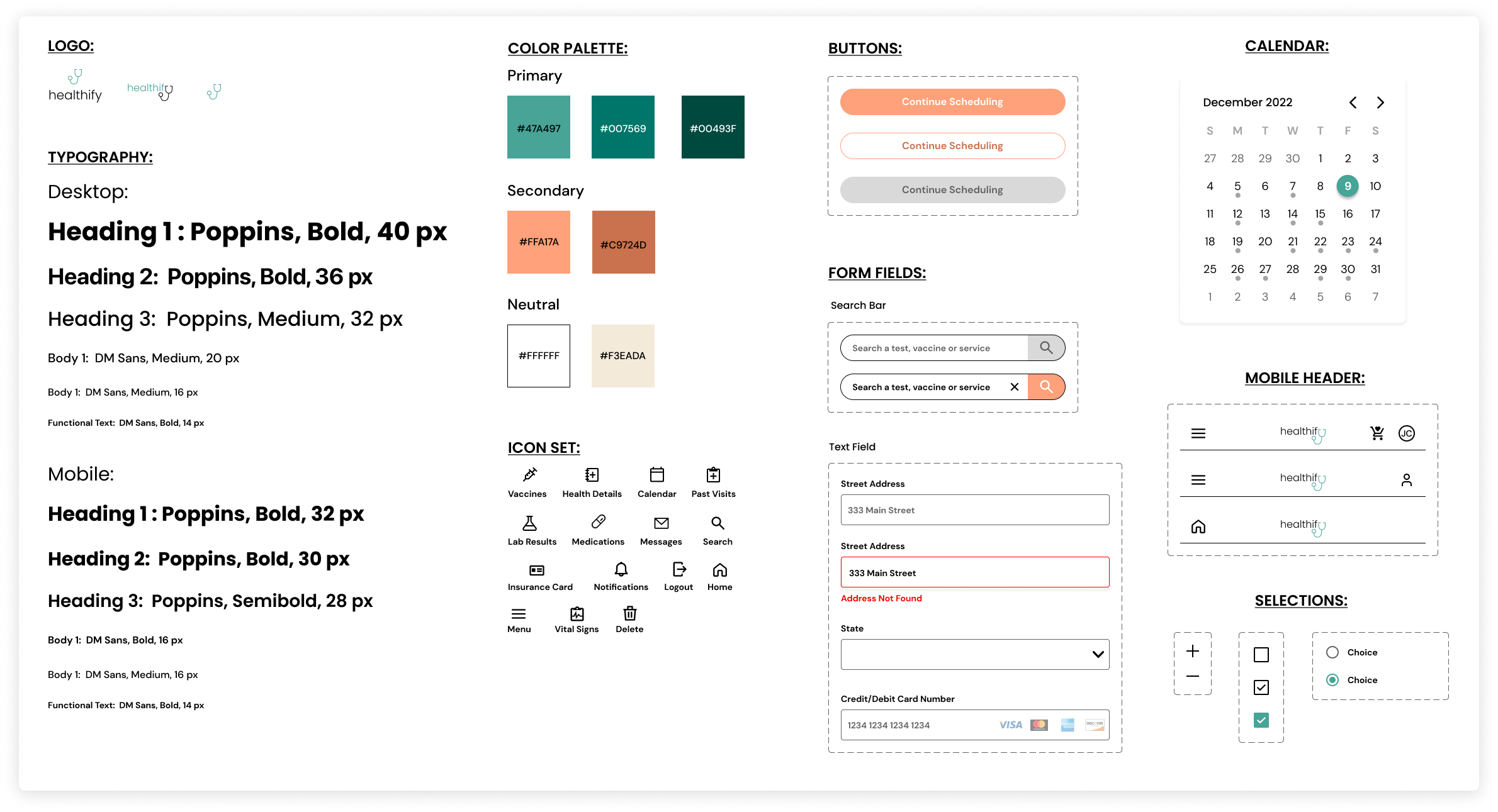
Brand Identity
High-Fi Wireframes:
With my brand identity established, I was ready to create my high-fidelity screens.
Test
Overview
With my high-fidelity prototype, I performed usability tests and used that feedback to iterate on my design.
Usability Testing
Analyzing & Prioritizing Results
Prioritizing the feedback I received with a feedback grid, I was able to hone in on what aspects of my design to include in the next iteration.
Success Metrics:
Task completion: 5/5 users were able to complete the given task flows.
Time: All users took less than 2 minutes to create an account and less than 3 minutes to search and schedule a service.
Error Rate: There were no marked errors.
Subjective Feedback: All users noted that the website was easy to use and intuitive.
Key Takeaways:
Overall, users found the website easy to use and intuitive.
3/5 users asked about insurance integration.
3/5 users were confused about what the annual subscriptions included.
2/5 users could not tell which appointments were available when scheduling.
Conclusion & Reflection
I solved my initial problem through in depth research that helped me better understand the industry, users' needs and gaps in the market. I was able to design a product that blends business and users goals to encourage users to prioritize preventative care.
A few things I learned from this project:
You have to be adaptable and flexible throughout the design process and able to change directions when needed
Receiving feedback is extremely important to making your designs the best they can be
User testing is so important to not only your overall design but finding small errors that you may have missed
Designing for all technology levels should be taken into consideration


