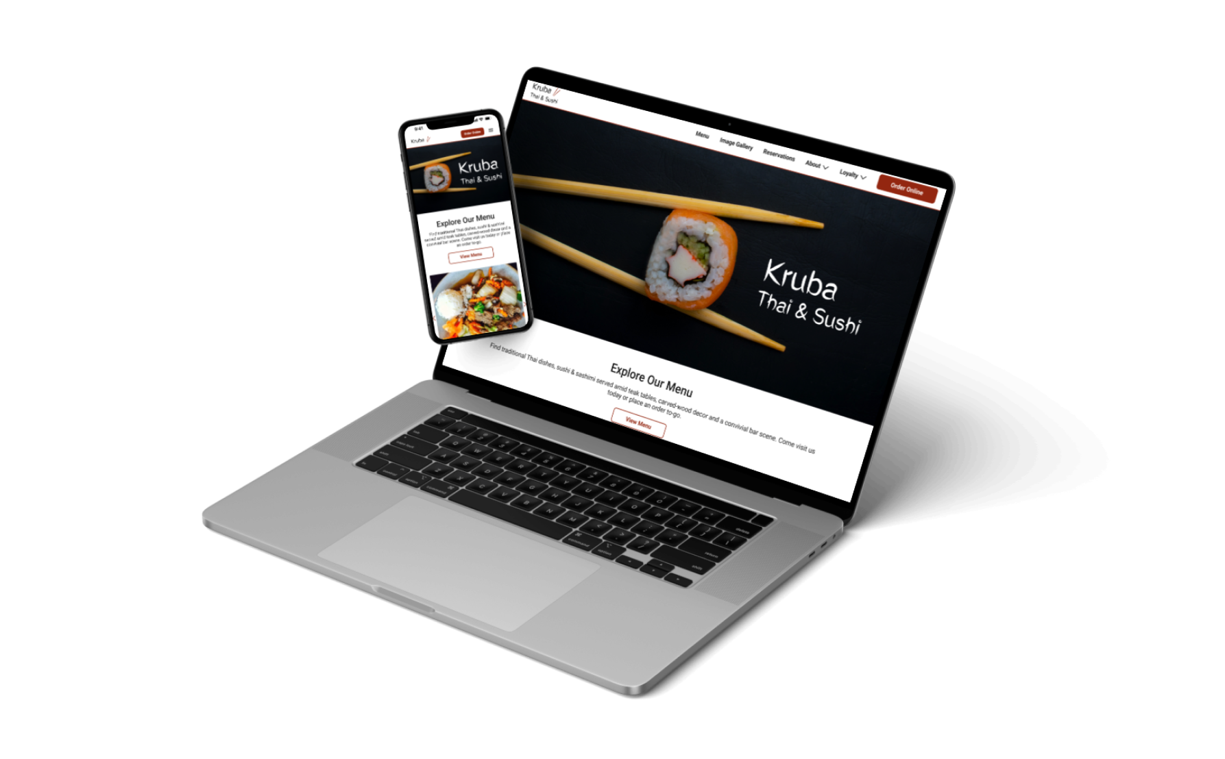
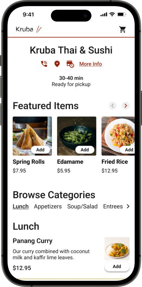
Kruba Thai & Sushi
Case study of a responsive website design for a small, local restaurant.
*Best viewed on desktop
Project Overview
BACKGROUND
Kruba Thai & Sushi is a small, local restaurant offering Thai food and sushi for dine-in or takeout.
THE PROBLEM
The overall UI of the current website is not very engaging or exciting. A lot of the images are very large compared to the text. The footer takes up a lot of space. There are placeholder images for all of the menu items instead of real images.
THE FOCUS
This company is looking to improve their website’s overall UI and draw more customers to order from their site vs. a third party platform. I will be redesigning their home page, menu page, and online ordering flow utilizing responsive web design.
MY ROLES
User Research
UX/UI Design
Branding
Prototyping
Usability Testing
TOOLKIT
TIMELINE
2 weeks, approximately 80 hours
Design Process
Discover
Research Goal
We want to learn what people look for in an online food ordering site so we can redesign Kruba’s website to attract more customers to order directly through their platform.
Learn how people typically order food to-go (online, call, in person).
Learn whether or not people use third party platforms to place pickup orders (yelp, uber eats, etc.)
Learn what people look for in an online food ordering experience.
Understand users’ goals and needs when viewing a restaurant’s website.
Discover what features users look for on a restaurant’s website.
Research Objectives
Research Methodologies
To conduct my research, I decided to do a combination of user surveys and competitive analysis to better understand the user’s needs and see how competitors organize their sites. Due to the time constraint and subject of the project, I opted for user surveys instead of interviews. My research objectives and questions were fairly straightforward and surveys allowed me to gather information from a larger pool of users.
Competitive Analysis
I performed a competitive analysis on other Asian restaurants in the area and came away with some key findings and opportunity areas for Kruba to stand out against the competition in a saturated market with a lot of options very close to each other.
Summary of Findings:
Most of the local Asian restaurants have pretty basic websites with simple UI
Not a lot of high quality images for any competitor sites
Common issues with online ordering (either not offered or not well optimized for mobile)
CTA is not clear/emphasized on many competitor sites
None of the sites had customer reviews but some had media mentions (articles, etc.)
User Surveys
Define
Overview
During the define phase, I took what I learned from discovery to plot out pain points and define the problem that both my user and business needed solved.
User Personas
With the data gathered from my research, I generated 2 personas to help understand my user’s goals, motivations, needs and frustrations.
The Problem
Ideate
Overview
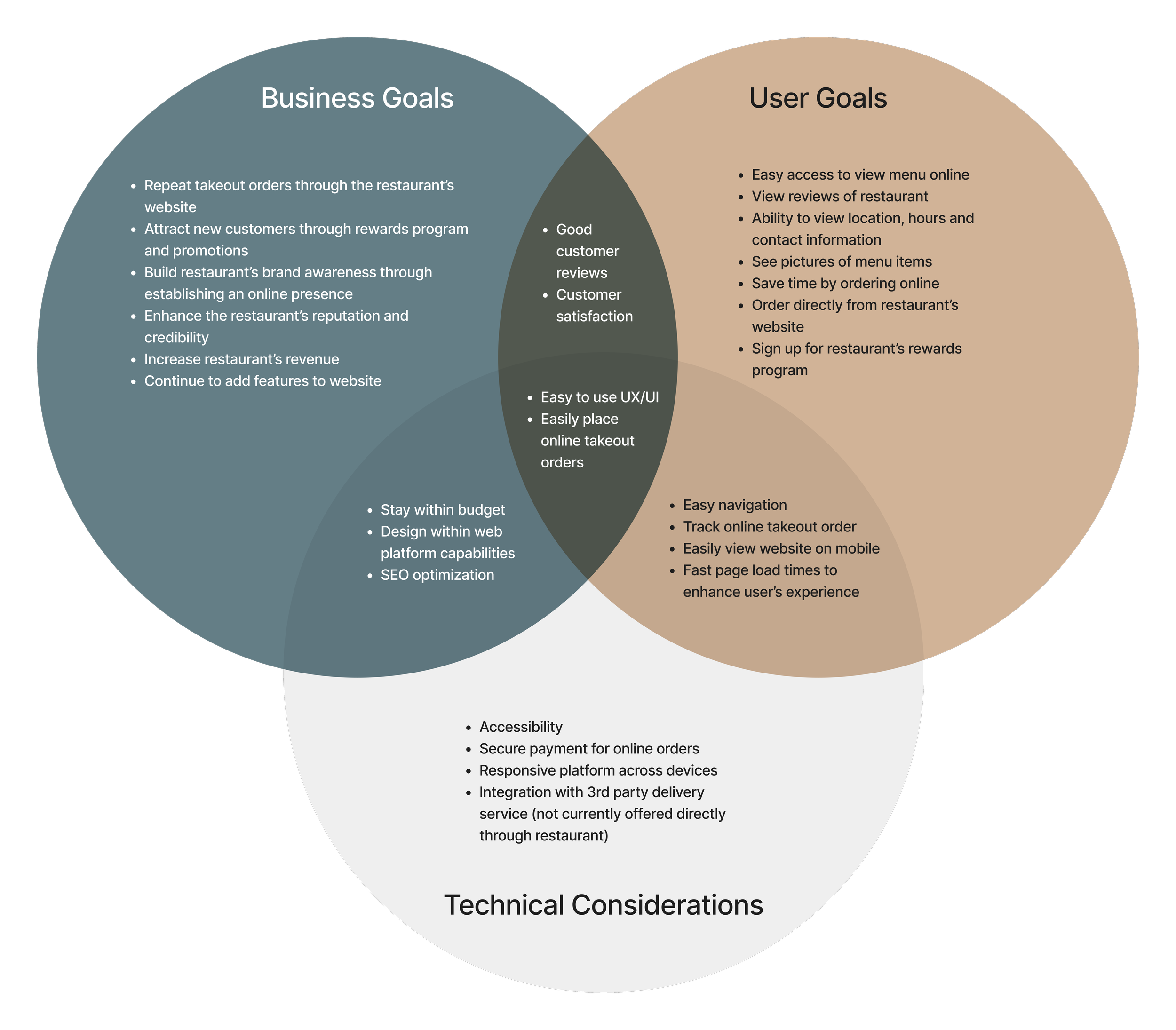
With my user and problem defined, I moved into the ideate phase of the process to come up with a solution to my user’s problem. To start, I mapped out the project goals to ensure the business goals, users goals and technical considerations were in alignment throughout this phase.
Product Roadmapping
With my project goals established, it was time to clarify what features would be needed for my minimal viable product through creating a product roadmap and prioritizing features.
Sitemap
Based on my product roadmap, I created a sitemap to plan the navigation of the site.
User Flows
With my user personas in mind, I created a user flow for placing a takeout order online.
Design
Overview
With my project goals established, a feature set decided on, a sitemap constructed, and user flows created, I entered the design phase.
Low-Fi Wireframes
I began by sketching key screens on paper for both mobile and desktop. I decided my key screens included the homepage, menu, contact, and online ordering.
Mid-Fi Wireframes
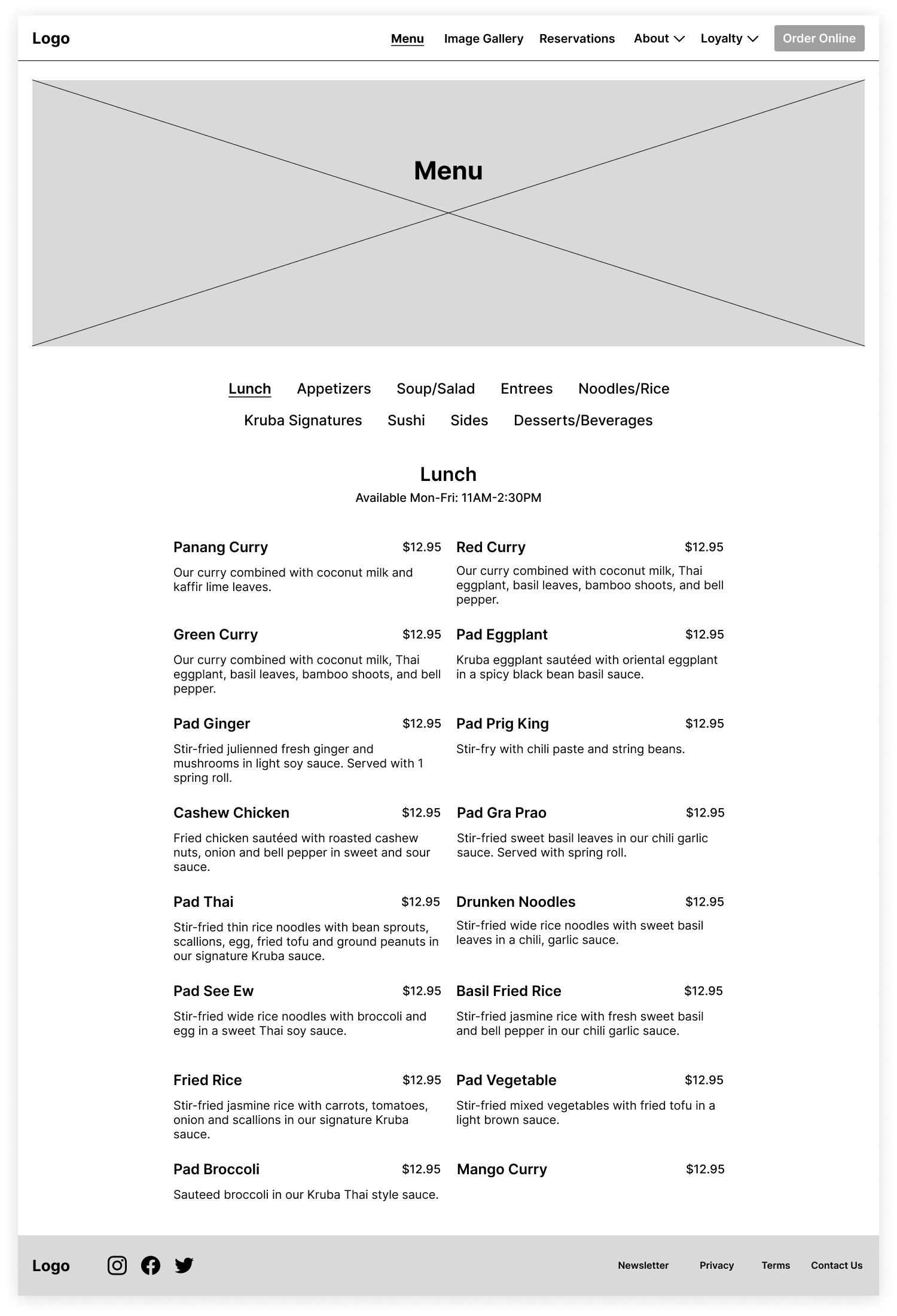
I then converted my low-fidelity sketches into digital format using only black, white and gray to prepare for prototyping and testing.
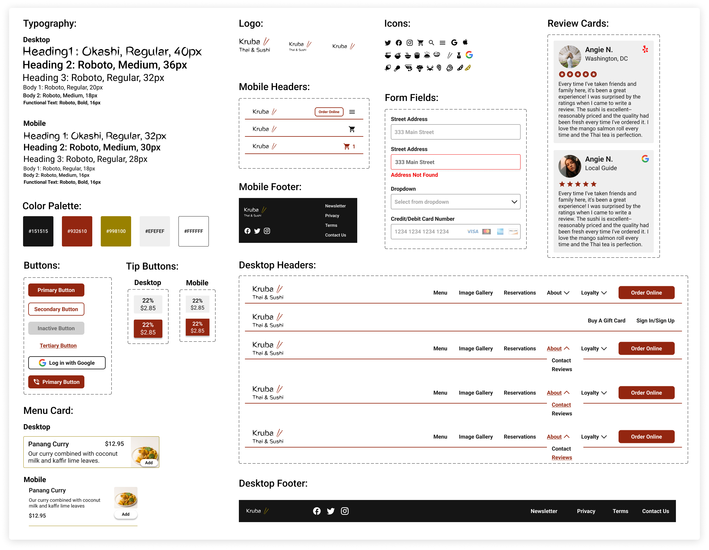
Brand Identity
High-Fi Wireframes:
With my brand identity established, I was ready to create my high-fidelity screens.
Test
Overview
With my high-fidelity prototype, I performed usability testing and used that feedback to iterate on my designs.
Usability Testing
Analyzing & Prioritizing Results
Prioritizing the feedback I received with a feedback grid, I was able to hone in on what aspects of my design to iterate on.
Success Metrics:
Task completion: 3/3 users were able to complete the given task flow on both desktop and mobile.
Time: All users took less than 3 minutes to place a takeout order on both desktop and mobile.
Error Rate: 1 user encountered an error with the prototype because the view was not fit to screen so some buttons were cut off. Another user encountered an error when trying to use their computer keyboard with the mobile prototype.
Subjective Feedback: All users noted that the website was easy to use and functional.
Key Takeaways:
Overall, users found the website easy to use and functional.
2/3 users noted they use a restaurant’s website when placing a pickup order if option available.
3/3 users wanted ‘order online’ to be more prominent on mobile version.
3/3 users did not use the search function on the online ordering screen.
Conclusion & Reflection
Working within a tight timeframe forces you to prioritize the aspects of the project that are most important. Designing a responsive website requires additional time to make a website both desktop and mobile friendly and when projecting the scope of a project it is important to take this into account.
A few things I learned from this project:
Responsive web design is extremely important to the user’s experience with a brand.
When working within a time constraint, it’s necessary to receive feedback but then prioritize and iterate based on what you deem most important because you likely will not have time to make every change desired.
This project allowed me to focus much more on the UI and visual elements of creating a web design. It’s important to remember the brand you are designing for and really hone in on that brand’s identity to help that shine through in your designs.
Let’s Compare
Before Redesign
After Redesign

