Careerist
Case study for designing an end-to-end mobile app.
*Best viewed on desktop
Project Overview
BACKGROUND
Young adults have to choose their college major and subsequently box themselves into a pool of careers they can pursue from that major 2-4 years later when they graduate at the age of 17/18. It’s a difficult decision to make at a young age and difficult to know what type of career you will want to be in throughout your adulthood.
THE SOLUTION
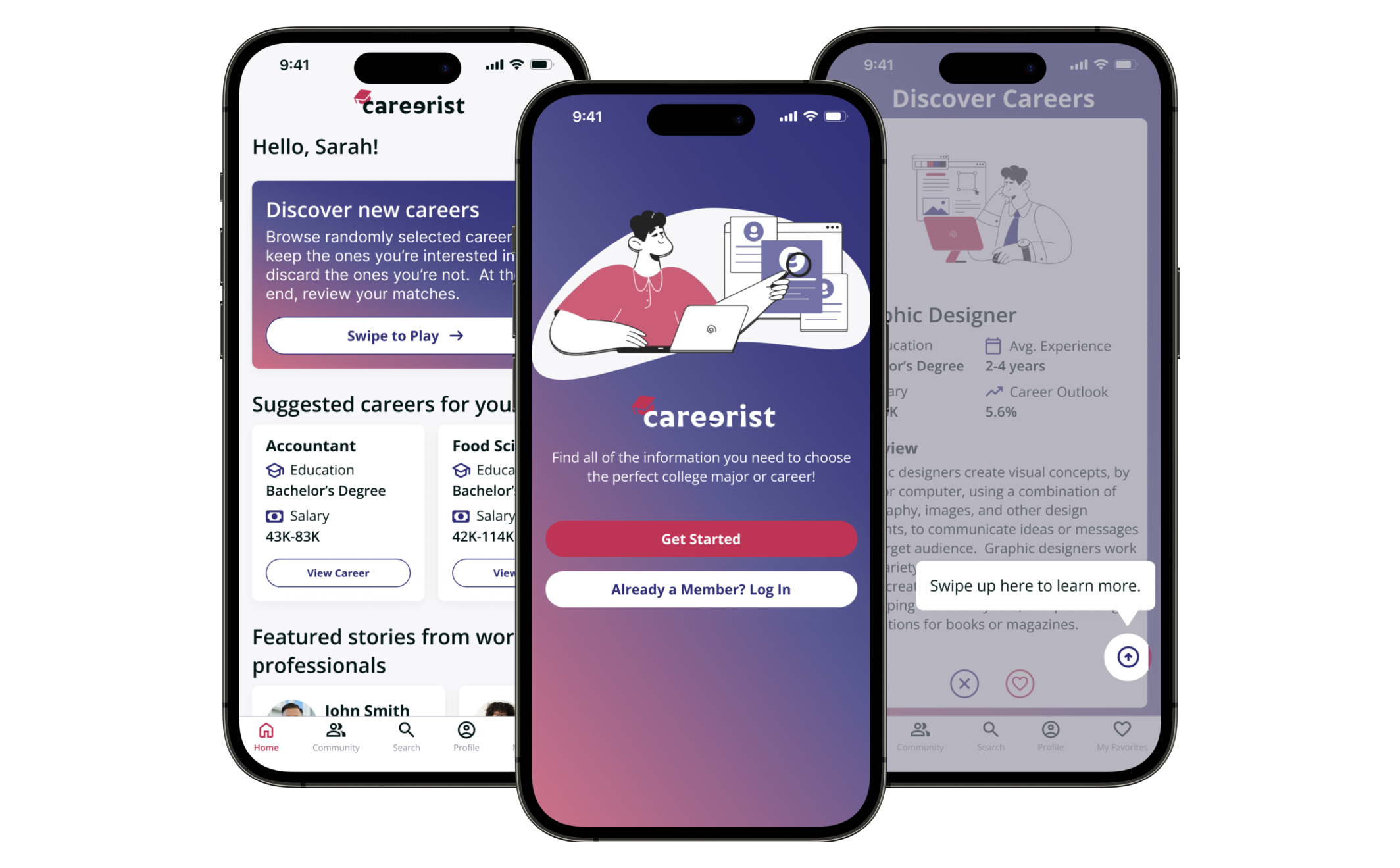
Careerist is an end-to-end mobile app that allows users to find all of the information they need about careers and college majors in one place. My research validated that young people lack knowledge on the career path they are choosing when deciding on a college major. Careerist helps to solve this problem by providing in depth information on a chosen career along with real life stories from professionals working in that industry.
THE PROBLEM
Young adults may end up choosing a college major that is interesting to them but they don’t necessarily consider the career opportunities that would follow. Further, at the age of 17/18, you may not consider all factors of a career path including salary, earning potential, career advancement, job market and projected industry growth. With so much information out there, it can be overwhelming and confusing to know what information to look for and where to look, especially if you’re not sure where to begin.
MY ROLES
User Research
UX/UI Design
Branding
Prototyping
Usability Testing
TOOLKIT
TIMELINE
2 weeks, approximately 80 hours
Design Process
Discover
Research Goal
We want to learn what users would like to see in an app for young adults to explore college majors and careers so that we can develop a product that is useful.
Learn how people choose their college major.
Learn what factors go into deciding on a career path.
Understand what information would be helpful to young adults who are exploring careers.
Identify if users would find an app related to exploring college majors and careers useful.
Research Objectives
Competitive analysis to see what competitors offer and what could be improved upon.
User interviews to understand how people choose their college major and career path, what information they sought to make those decisions and what information they wish they knew before making those decisions.
Research Methodologies
Competitive Analysis
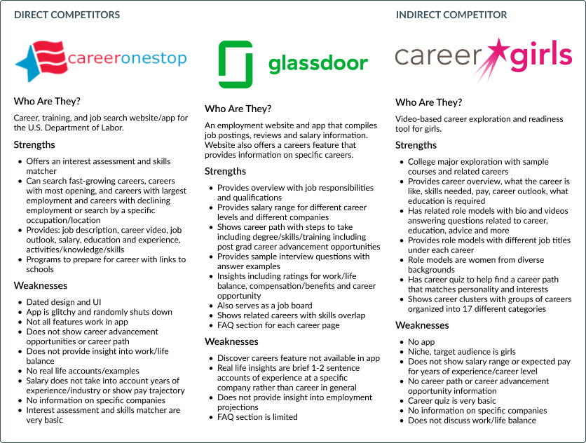
Although there are many resources out there for help in finding a career, most are either job boards or some form of a career aptitude test/career matcher.
Summary of Findings:
Out of the resources I found, the only site that offers an app was careeronestop and the app was very glitchy to use with an outdated design.
Glassdoor provides a lot of good information on specific careers but this information is not available in their app, they also lack real life insights into a given career.
Career girls provides videos of role models in each career describing their experience but lacks the in depth information that glassdoor offers.
User Interviews
Define
Overview
During the define phase, I took what I learned from discovery to plot out pain points and define the problem my user needs solved.
Affinity Mapping
Affinity mapping helped me synthesize the qualitative data I received during my user interviews.
User Personas
With the data gathered from my research, I generated 2 personas to understand my user’s goals, motivations, needs and frustrations. Both personas were used to help inform design decisions throughout this project.
The Problem
Ideate
Overview
With my user and problem defined, I moved into the ideate phase of the process to better outline product development. To start, I mapped out the project goals to ensure the business goals, users goals and technical considerations were in alignment throughout this phase.
Sitemap
With my product features decided on, I then created a sitemap to plan the navigation of the app.
User/Task Flows
With both of my user personas in mind, I created user flows for the 2 main tasks in my MVP:
Log in/create an account
Search for and save a career/major
I also created the user flow for booking a mentor session, which is a feature that would be added to the product later on.
Product Roadmapping
It was important to then decide what features would be included in my minimum viable product and what features could come later.
Design
Overview
With my project goals established, a sitemap constructed, and user flows created, I entered the design phase.
Low-Fi Wireframes
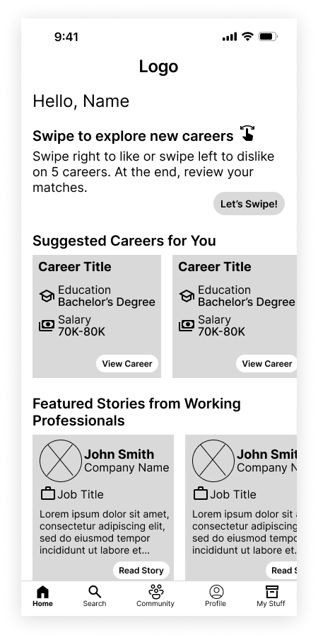
I began by sketching key screens on paper. I decided my key screens included log in/sign up, creating a profile, homepage, career details page and like/save page.
Mid-Fi Wireframes
I converted my low-fidelity sketches into digital format using only black, white and gray to prepare for prototyping and testing.
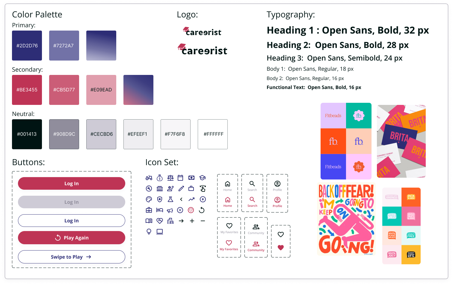
Brand Identity
High-Fi Wireframes
With my brand identity established, it was time to create my high-fidelity screens.
Test
Overview
I performed usability testing with my high-fidelity prototype and used that feedback to iterate on my designs.
Usability Testing
Analyzing & Prioritizing Results
Prioritizing the feedback I received with a feedback grid, I was able to hone in on what aspects of my design to iterate on.
Success Metrics:
Task completion: 4/5 user were able to complete the given tasks on the prototype of the website. 1/5 users had trouble finding the option to save a career.
Time: 1/5 user could not find the bookmark icon to save a career. All users were able to create an account, swipe to explore careers and search for a career seamlessly.
Error Rate: No errors were encountered during testing.
Subjective Feedback: All users noted that the app was easy to use and provided useful information.
Key Takeaways:
Overall, users found the app easy to useful and thought it provided good information.
All users liked the experience of swiping to explore careers and thought this was a surprising and fun feature.
1/5 users thought the bookmark icon should be more clear.
1/5 users wanted the option to remove a match in my stuff.
1/5 users asked about social log ins during creating an account.
2/5 users wanted it to be more clear that there was more information beyond what was shown in the ‘swipe to explore’ game.
2/5 users asked about information on how hard it was to get a job in that career.
2/5 users asked what the job growth statistic meant.
Final Designs
Conclusion & Reflection
Designing an end-to-end app requires in-depth thought regarding what features to include in the MVP vs. what features can come later in the product’s development.
A few things I learned from this project:
In order to develop a product that is both desirable and useful, research and testing should guide product development decisions.
Creating an app involves designing interactions that are intuitive, efficient, and enjoyable for users. Sometimes this means breaking down steps into separate screens to avoid information overload and sometimes this means providing walk-through instructions for first time users to better understand how the app works.
Incorporating an unexpected element to an app (swipe to explore careers) adds to the desirability of the app, enhances the user’s experience, and ultimately helps your app stand out against the competition.


